...
- Though the horizontal menu is cute, finding the different functionalities of the site requires extra clicking, which reduces efficiency. An interface with all the functionality on the same page would provide greater visibility still.
- The interface is slightly unappealing aesthetically, with a very boxy feel rather than a smooth web 2.0-style appearance.
Design 3
Storyboard
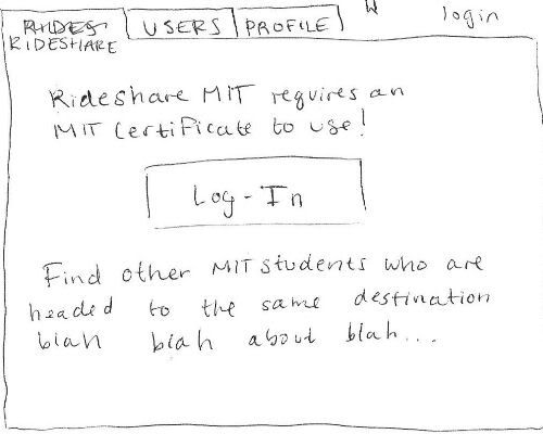
The third design features a tabbed design similar to design two. When Aly navigates to the RideShare homepage she is presented with a home screen that will tell her a little bit about the service and let her log in using her MIT certificate. Once she logs in, the home screen is replaced by a window that lists available rides.
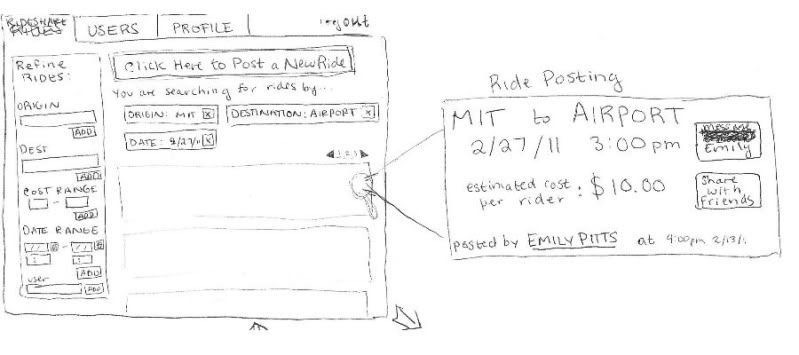
The RideShare window first displays all rides (in a paginated fashion) by date posted. Aly can then add 'tags' using the panel on the left to refine her search. She adds tags for Origin, Destination, and Date so that the search results only display rides going to the airport from MIT on the date she wants to travel. The zoomed in part of the image above (on the right) shows the layout of a ride listing. The interface uses a metaphor here, laying out the listing similar to a train or bus ticket. The listing allows Aly to message the poster, share the ride with friends, or view information about the user that they have posted on their profile.
However, Aly isn't happy with any of the listings she's found, so she decides to post her own.
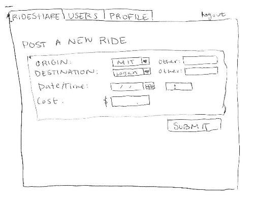
Clicking Post a New Ride (a prominent button at the top of the rideshare page) takes Aly to a new window with just the form for posting a ride. It asks her to enter fields such as 'Origin', 'Destination', 'Date/Time', and 'Cost'. All fields are required, for simplicity.
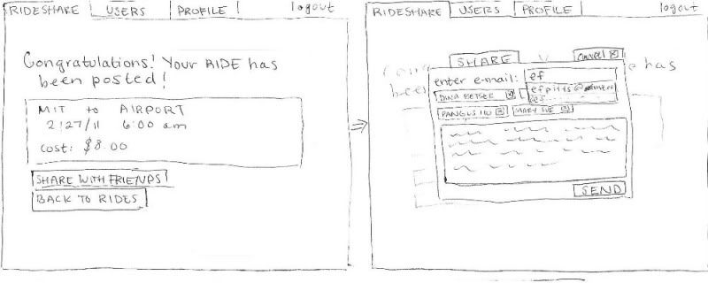
After she presses submit, she gets a confirmation message that shows exactly what she posted and options to share with her friends or go back to browsing rides. She decides to share her ride with some friends to see if they are interested. A window pops up over the current screen that allows her to add friend's emails in a system similar to the tagging method of refining results. She can also edit the default message before pressing send, which causes the window to disappear and take her back to where she was before.
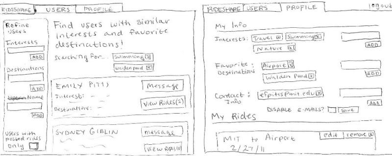
At this point, Aly has completed the task at hand, but she could also fill out some information about herself in the profile tab (right) or browse for users with similar interests (left) to find people she might want to travel with.