...
- Search for a ride share
- Post a new RideShare listing for her desired time and destination
- Invite friends to see her RideShare post
Designs
Design 1
The main feature of this design is that it consists of only one page. When a user clicks the buttons to navigate through the website, different sections of the page will pop up and disappear, but the user never leaves the home page of the website.
Storyboard
Aly opens the RideShare website. The website will ask her to provide an MIT ceritificate immediately because the site is only open to the MIT community.
...
Now Aly is done and she returns to the home page of RideShare. When another user is interested in sharing a ride with her, she'll be notified through her email.
Analysis
Pros:
- Having all the main features on a single webpage greatly increases visibility. Users do not have to navigate around to find the things they need. It also increases efficiency by decreasing loading time because the user only loads a section of the page every time he performs a new function.
- Asking the user to provide an MIT certificate upon entering the website lets the website identify the user immediately. For instance, when the user opens the site, the page can notify the user immediately if someone is interested in sharing a ride with her.
- The "Recent Activities" section increases the learnability of the website and helps users advertise their ride posting, as has been explained in the Story Board section.
- The auto-completion feature increases efficiency and prevents typing errors.
...
- This design features a top horizontal menu bar that exhibits all of the main features of our website--searching for a ride share, posting a new listing, and managing profile settings. It is a design that favors simplicity and visibility, with access to the three main features of the website prominently displayed.
- The map preview feature in search results allows the user to see exactly where the meeting location is, which provides a useful visual cue to the user about where the Ride Share would occur.
- Efficiency is augmented with the pre-population feature that fills in the form for posting a new Ride Share after the user was unable to find a matching Ride Share in a search.
- The annoying certificate popup occurs only after a user action that requires login, postponing the hindrance to efficiency until it is absolutely necessary.
- The side modification panel for refining a search allows for error recovery if the user would like to search for something else other than what the user has already searched. The pre-population of that panel means the user would only need to tweak the fields and search again in the case of an error.
Cons:
- Though the horizontal menu is cute, finding the different functionalities of the site requires extra clicking, which reduces efficiency. An interface with all the functionality on the same page would provide greater visibility still.
- The interface is slightly unappealing aesthetically, with a very boxy feel rather than a smooth web 2.0-style appearance.
Design 3
Storyboard
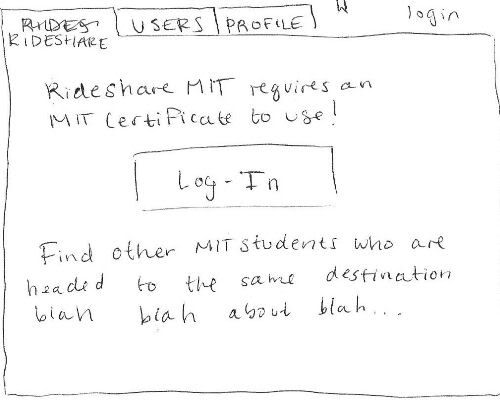
The third design features a tabbed design similar to design two. When Aly navigates to the RideShare homepage she is presented with a home screen that will tell her a little bit about the service and let her log in using her MIT certificate. Once she logs in, the home screen is replaced by a window that lists available rides.
...
At this point, Aly has completed the task at hand, but she could also fill out some information about herself in the profile tab (right) or browse for users with similar interests (left) to find people she might want to travel with. Note that the tagging system is used again to add interests to the profile or to refine the list of users Aly is searching for.
Analysis
Pros
- Using tags to refine search results (rather than requiring the user to enter all the information about their desired ride) allows the user to browse a broader spectrum of rides and might help them find what they want faster if they don't know exactly what they're looking for.
- The tag-based searching system is used throughout the site, providing simplicity and consistency.
- Tabbed navigation makes the purpose of each window very clear and organizes the layout nicely.
- The design provides good feedback on what the user is doing (i.e. showing the user exactly what he posted after he presses submit).
Cons
- More navigation is required in this design than the first, where basically everything happens in one window. This could be confusing to new users.
- Although the ticket metaphor looks nice, it may not be the most efficient way to convey the information about the ride to the user.
- The tagging system might slow down users who know exactly what they are searching for.
